
A Few Drawings
I've taken two drawing courses so far at the University of Oregon . Mostly, they involve doing charcoal drawings of still lifes or of models. Sometimes, though, they get into more involved things. Here are a few of those from my most recent drawing class.
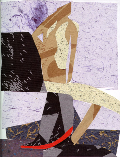 One of our assignments was to come into class with a bunch of different
interresting papers. I basically went down to the university book store and
looked through all the little 1/8
th
sheets they have. They're nice enough to cut up some of their expensive,
interresting papers for people to buy in small quantities. So I got ten or so
of these little sheets, and during class I made this cutout picture based on a
male model that we had that day.
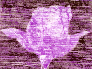
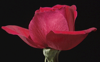
This was the beginning of my experimentation with line art. I printed out the rose on the right and used it as a guide. I doctored up a piece of paper with a thick layer of oil pastel, and then drew through like a carbon copy. Finally, I went over the backgroung a second time in a different color to enhance the contrast.
I think that if I had it to do again, I'd choose a darker color for the facsimile. Perhaps black? I chose that rosy color because... well, you get the idea. I think it wasn't dark enough to get the full contrast of the rose.
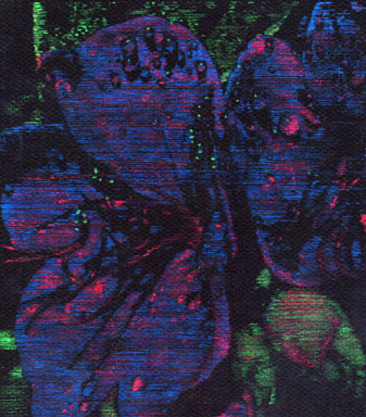
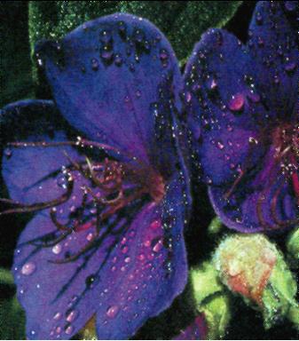
So I thought to myself, why not go one further, and do it in color? I could use a three-color method... So I did. Partly, I wanted to prove to my teacher that RGB could work in print.
Some basic color theory
You see, when pictures are printed on things like magazines and posters, they use what's called a four-color process. In that process, they use cyan (sky blue), magenta, yellow, and black (These colors are know collectively as CMYK). The inks they use are transparent, so that you can, for instance, lay magenta on top of yellow and get red, or cyan on magenta and get blue. It turns out, in fact, that you can theoretically get any color at all from just cyan, magenta, and yellow. They add black in because it's hard to get a good black by mixing those colors, so they cheat a little.
Now on TV and computer screens, things work differently. Wereas on paper you're working on a white surface, on a scrren you're working on a black surface. So What they do is show little pinpints of red, green, and blue light on the screen. When you look at these from a distance, they melt together to form an overall color. If you have maximum in all three colors then you'll see white. (You can try this yourself with red, green and blue flashlights -- just shine them on the same place on the wall, and it should come out white).
So my theory is that it should be possible to use _opaque_ inks on _black_ paper to produce an RGB image just like it appears on the computer screen. Unfortunately, I didn't choose the best medium to test my theory. The pastels ended up sticking to each-other and not getting good enough gradations. Plus, it was just plain hard to tell by hand how much there should be of each color component. Basically, it didn't work. I remain confident, though, that some day I'll be able to prove my point.
